Module 2: Creating a Table Visualization
Getting the Data
- Get data -> Spreadsheet
- If the workbook contains multiple tables or sheets, select the one or two tables needed for the exercise. Keep the initial import focused; additional tables can be loaded later if they are required.
- Select a table to view its preview. Use the preview to confirm that the columns and sample values look correct before loading the data.
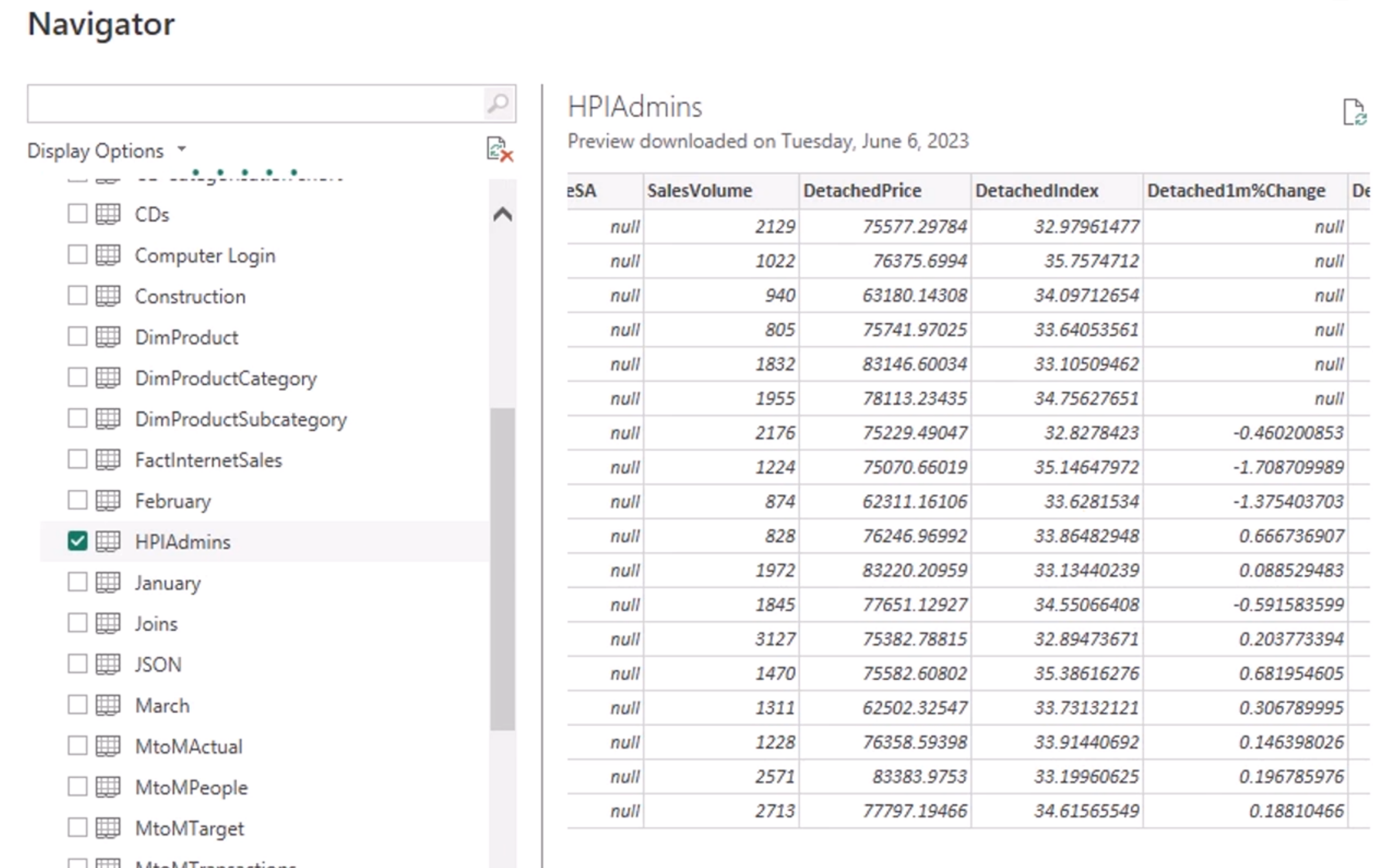
- Select Load to bring the data into the model. Data transformations can be completed later in Power Query when needed.
- On the right, notice the Data pane. It lists the tables and columns imported from the spreadsheet, generally in alphabetical order.
- A sigma symbol indicates that Power BI recognizes the field as numeric and may summarize it automatically, such as by using Sum or Average.
- Select a few fields from the Data pane. Power BI will create a default visual based on the selected data types, giving you a quick starting point for exploration.
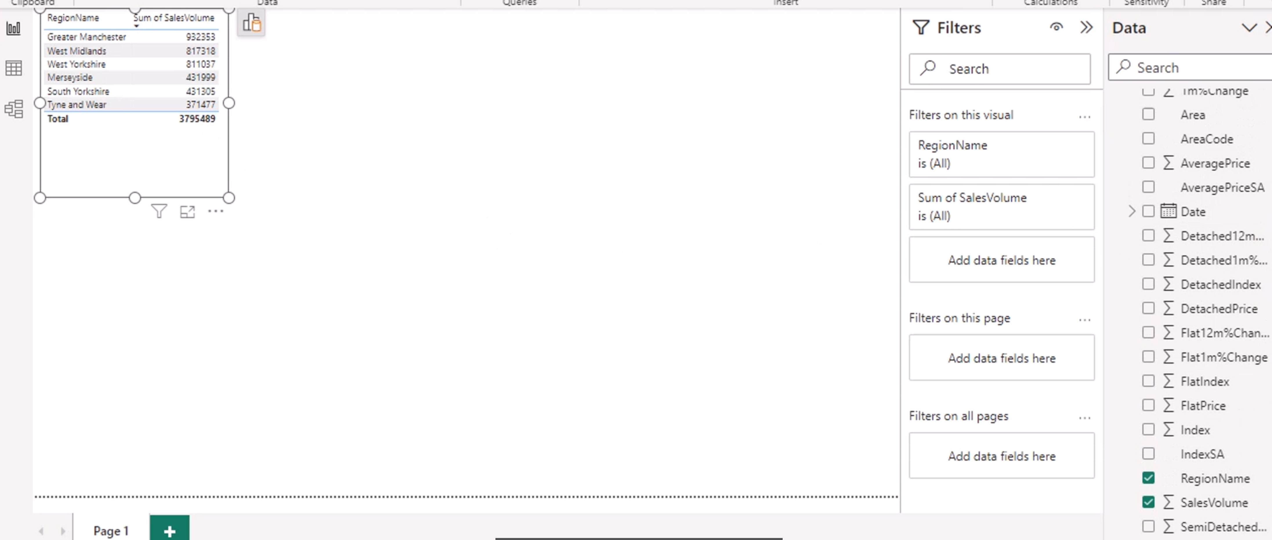
- Selecting a field's checkbox adds it to the active visual. Deselect it to remove the field, or drag the field to a specific visual field well when you need more control.
Tip: A good visualization answers a specific question quickly. Start with the audience and the decision they need to make, then choose the simplest visual that communicates the answer clearly.
Building a Table Visual
A table visual is useful when the audience needs to inspect exact values, compare individual records, or export a detailed list. It is usually a better choice than a chart when precision matters more than trends or relative size.
To configure a table:
- Select the table visual from the Visualizations pane or change the selected visual to Table.
- Add descriptive fields first, such as File extension, so each row has a clear label.
- Add numeric fields, such as Size, and check the aggregation Power BI applies. Numeric fields often default to Sum, but you may need Count, Average, Minimum, Maximum, or Don't summarize depending on the question.
- Reorder fields by dragging them into the desired order in the visual's data field well.
- Resize columns or enable word wrap when headers or values are difficult to read.
Before treating the table as complete, check for unexpected totals, blank values, duplicate rows, and incorrect numeric aggregation. These are common indicators that a field needs to be summarized differently or that the model needs additional preparation.
Exploring Power BI Desktop
The Ribbon provides the main commands for building and managing a report:
- File: Create, open, save, export, and configure Power BI Desktop options.
- Home: Connect to data, transform data, refresh the model, and publish reports.
- Insert: Add visuals, text boxes, buttons, images, shapes, and other report elements.
- Modeling: Create measures, columns, tables, relationships, and security roles.
- View: Change the theme, page view, layout, gridlines, and visibility of the right-side panes.
- Optimize: Use performance tools and pause visual queries when working with complex reports.
- Help: Access learning resources, documentation, and diagnostic information.
Right-hand side panes commonly include:
- Filters: Apply filters to a visual, page, or entire report.
- Data: Browse the tables, fields, measures, and columns available to the report.
Additional panes, including Format, Build visual/Data, and Drill, appear or change based on the selected visual. Select a visual first to see its available configuration options.
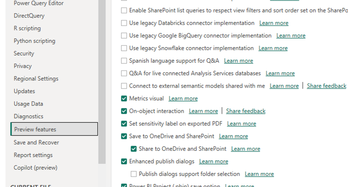
Tip: In Options under Preview features, enable On-object interaction if the course requires it. This allows you to build and format visuals directly on the report canvas.
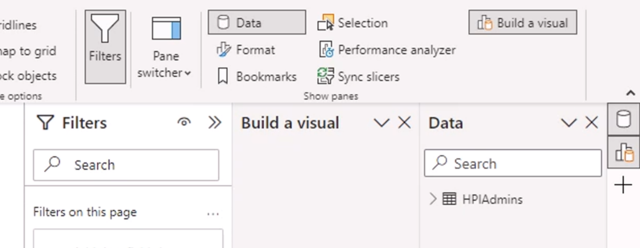
Another tip: Enable the Pane switcher so that the Data, Build, Format, and Analytics panes remain easy to access as you work.
Exploring Power BI Desktop
The icons on the left move between the three primary views:
- Report: Build report pages by adding and arranging visuals.
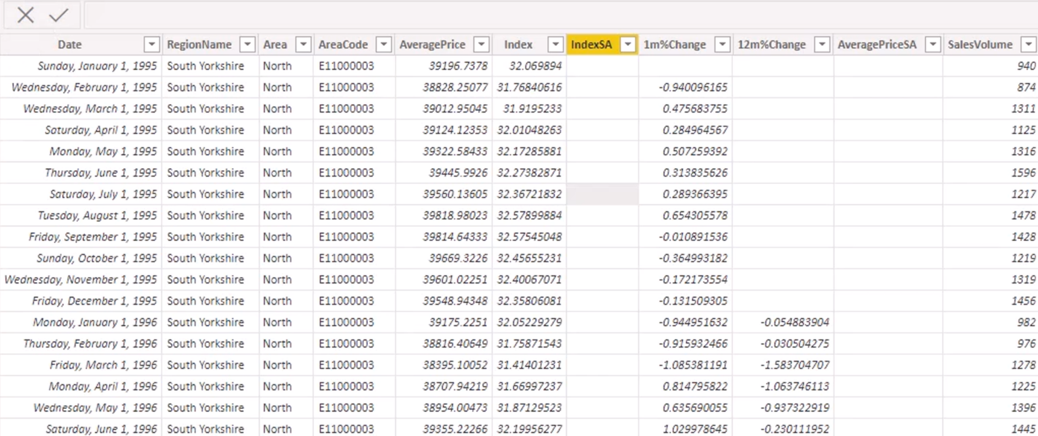
- Data: Inspect the rows and columns in imported tables, similar to a read-only Excel-style view.
- Model: View and manage table relationships, data structure, and model design.
Data
Filters are available at several levels: visual, page, and report. For example, you can filter a date field between two dates, include only dates from 2025, or limit a visual to a selected set of categories.
Tip: Filtering does not change the underlying data. It only controls which records are displayed or included in a calculation.
Another tip: The Data view is for inspection, not manual editing. Correct source data at the source system, or use Power Query transformations to clean and reshape imported data.
Sorting and Filtering a Table
Use a table column header to sort the visual by that field. Select the header again to reverse the sort direction. Sort numeric fields by their actual numeric value, not by a formatted text value.
Use the Filters pane to limit the data displayed in the table. Filters can apply at different levels:
- Visual-level filters affect only the selected table.
- Page-level filters affect every visual on the current report page.
- Report-level filters affect all report pages.
Use visual-level filtering when a table needs a focused view while other visuals must retain the complete dataset. Confirm the active filters before sharing or publishing the report so that intended records are not hidden accidentally.
Focus mode
Use the zoom controls in the lower-right corner to zoom in or out while designing the page. Canvas size is another useful setting for choosing the report layout, such as 16:9, 4:3, or a custom size.
Select a visualization and choose Focus mode from its header to display it in a larger view. Focus mode removes surrounding report content so the visual is easier to inspect and discuss.
Choose visuals based on the data and the question being asked. Some visualizations are not meaningful for certain data shapes; for example, a scatter plot needs multiple data points to show a relationship or distribution.
Note:
- When a visual is selected, choosing another visual type replaces the selected visual while retaining compatible fields.
- When no visual is selected, choosing a visual type adds a new blank visual to the canvas.
Theme options include Dark, Light, and system setting. The application theme changes the Power BI Desktop interface; it does not automatically change the report canvas or the report theme.
Creating a work address
-- Publishing to the Power BI service requires an organizational work or school account. A Microsoft 365 Business tenant can provide this type of account for personal learning environments. Use an account and tenant that you are authorized to administer.
Saving your Visualization
Click Save to store the work as a .pbix file. This file contains the report pages, model, queries, and local work in progress, giving you a restorable save point.
To make the report available in the Power BI service, publish the .pbix file. You need a Power BI account and appropriate workspace access to publish.
Sign in, choose or create an appropriate workspace, then publish the report. Use a personal or sandbox workspace for course exercises unless the report is ready for a shared team workspace.
After publishing, open the report in the Power BI service and verify that the visual renders correctly, filters behave as expected, and the report is in the intended workspace. Publishing sends the current .pbix content to the service; later local changes require another publish to update the service version.
Activity
-
Open Power BI Desktop. In a new Power BI file, use Get Data to open the PowerBIData workbook and select the spreadsheet named PA - CDs, not CDs. The PA version is the workbook prepared for these practical activities.
-
Select the File extension and Size fields from the Data pane.
-
If Power BI creates a bar chart, change the visual type to Table. Confirm that File extension is shown as a category and Size is summarized appropriately.
-
Save the
.pbixfile locally, then publish it to the Power BI service workspace available to you.
Review the published report to confirm that the table and its fields appear as expected.